

Seattle Light Rail Signage
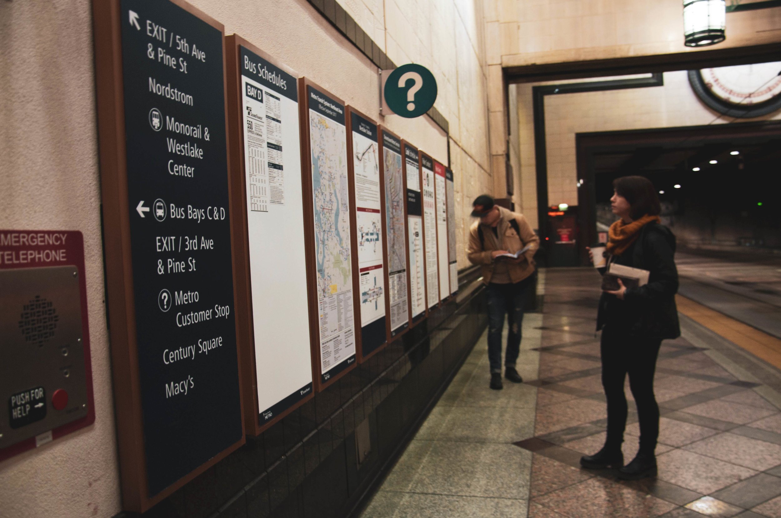
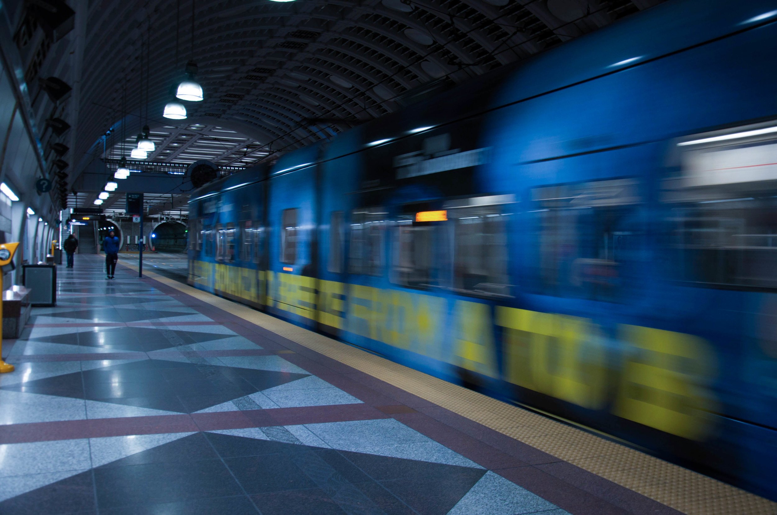
The city of Seattle is home to more than 700,000 individuals, and it’s growing. The current system can be confusing even for a local. Discreet signage and poor legibility make it difficult to quickly determine directions and schedules. As the Transit Tunnel is underground, riders can feel disoriented and the lack of obvious signs makes it difficult to determine where to go. Add to this the confusion experienced by speakers of other languages, and this is a recipe for an ineffective system.
-
Owen Richard (Me), Dallas Dyson, Hannah Chute
-
WWU BFA Design Program, 2018
-
Bellingham, Washington
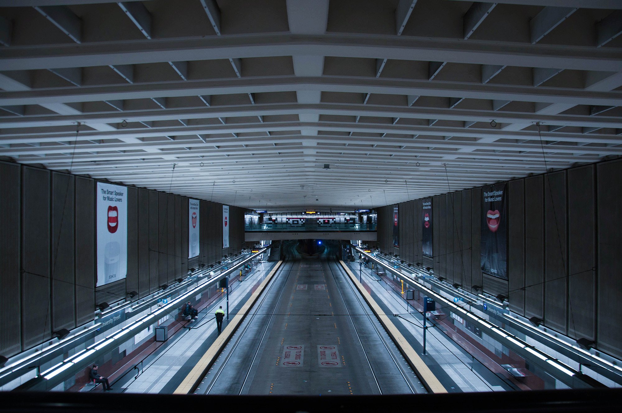
While the transit system does a decent job in getting riders to their destination, the signage UX does little to truly take riders on a journey. Our team sees an opportunity to redesign the Downtown Seattle Transit Tunnel stations’ signage.

As we started addressing the research we had gathered, we found ourselves somewhat unsure of what direction to take. While visiting Seattle was helpful in understanding how the light rail and bus stations work, but we became entangled in constraints we faced. Because we weren’t looking at things from the ground up, we were boxing ourselves in and limiting our design solutions to what features the Transit Tunnel currently exhibits. We needed to take a different route.
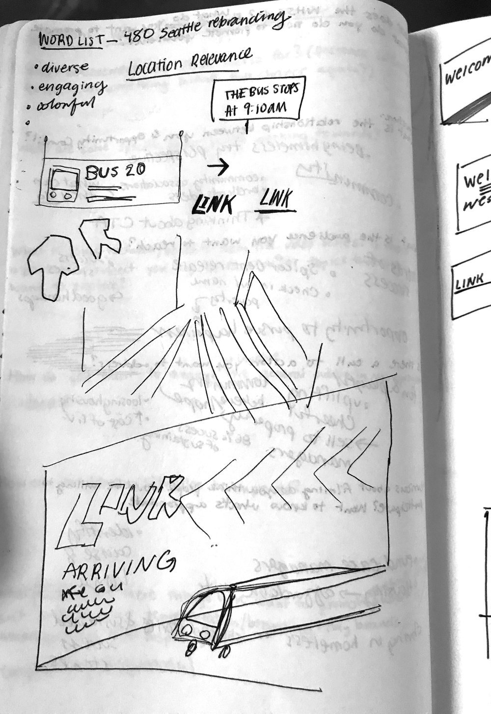
Time to pivot.
We reassessed our data and decided to avoid the constraints we were putting on ourselves. Looking back at our brief and what we wanted to accomplish, we determined it was necessary to shift our focus in order to design for a more appropriate end product.
Initial Brief:
1. Educate and inform riders of how to use the transportation system
2. Design for multilingual accessibility
3. Transform space into more
New Goals:
1. Riders should see what is important to the station they are in.
2. Riders should be able to quickly determine the directionality of the route
3. Riders should be able to see wait times and identify times quickly.
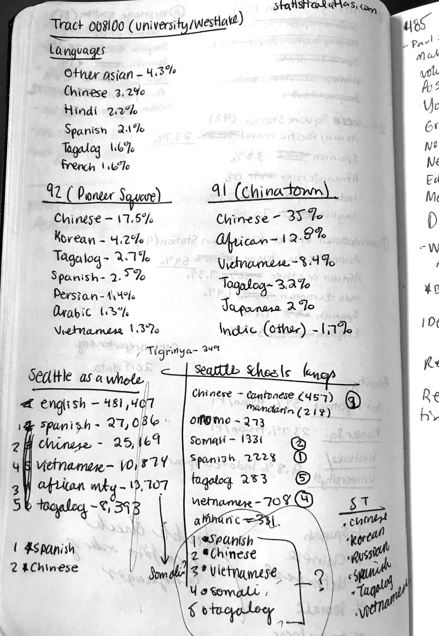
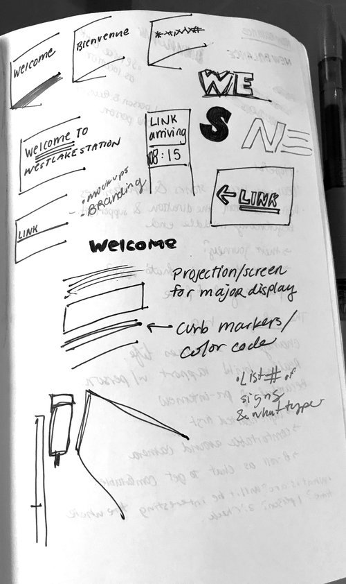
By focusing on these three things we gave ourselves permission to use multiple languages as a design element rather than the sole purpose of a strictly-functional redesign. After looking at these factors, we decided in order to meet the brief we will have a display for light rail information, bus information, and something that provides visual interest.
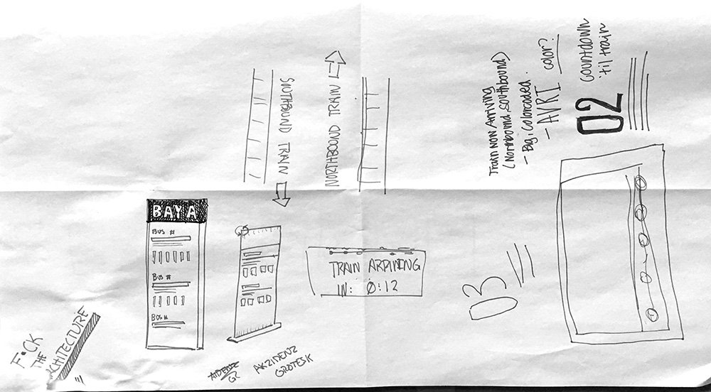
We decided to use a two color system to address the directionality of the systems, one color for north, one for south. We separated the bus and the light rail and put their important information in relevant and separate areas. The system relies on digital displays or projections to show the information. This keeps the information displayed most relevant to the riders. There were three main displays we designed as a part of this system.
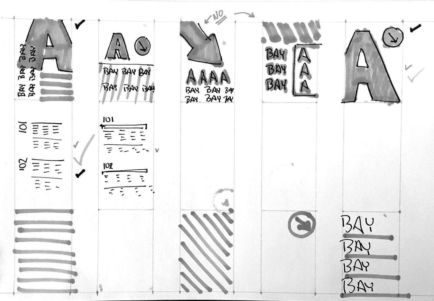
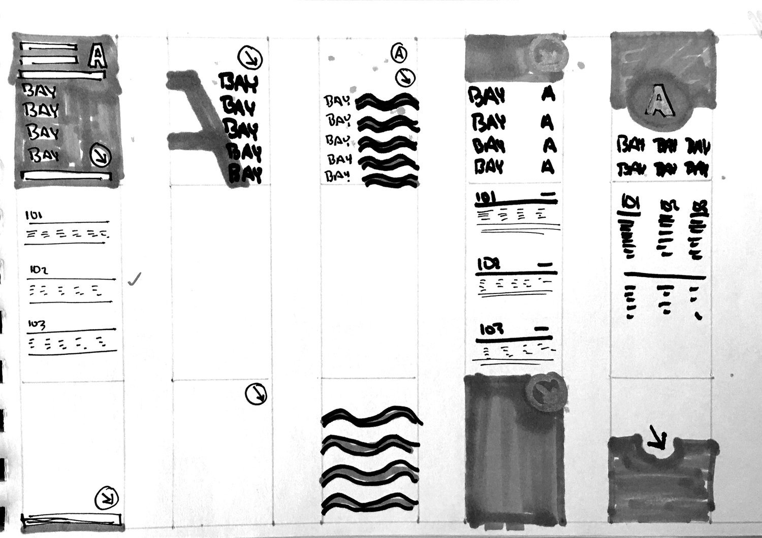
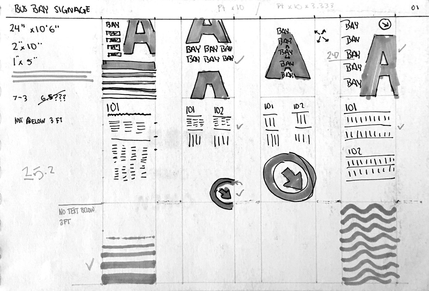
Current bus bays are marked by small panels on tall poles. They are difficult to notice unless you are looking hard for them, and even then it can be a challenge to spot. We made the information clearer by designing tall display posts that included the information relevant to the bay specific buses, as opposed to having the information on the wall where our light rail information is displayed.

B-Side bus bay heading North
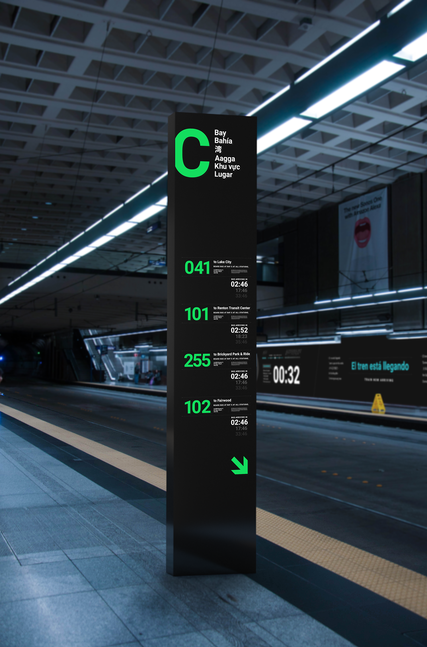
C-Side bus bay headed South
In order to show riders the light rail information, we decided to use the wall space in the Transit Tunnel to our advantage. We broke the wall into three parts, with train information on the two ends and a more visual piece in the middle.

B Side Train wall

C Side Train wall
Conclusion
Our redesign of the system and branding of the Downtown Seattle Transit Tunnel reevaluates the standard for public transportation. It simplifies the information and makes it accessible to a wider audience. It stays true to Seattle and aims to take riders on a more unique transit journey, for however long they may be in our city. If we were to continue working on this project there are some areas we would like to address. It would be great to do some testing and have real trials with our signage to see how they work in person. It would be also great to develop even more thorough brand guidelines and extend this system of branding and identity across more platforms and different areas in Seattle's public transportation system. We see potential for an even stronger and more cohesive identity by extending the project into these areas in the future.